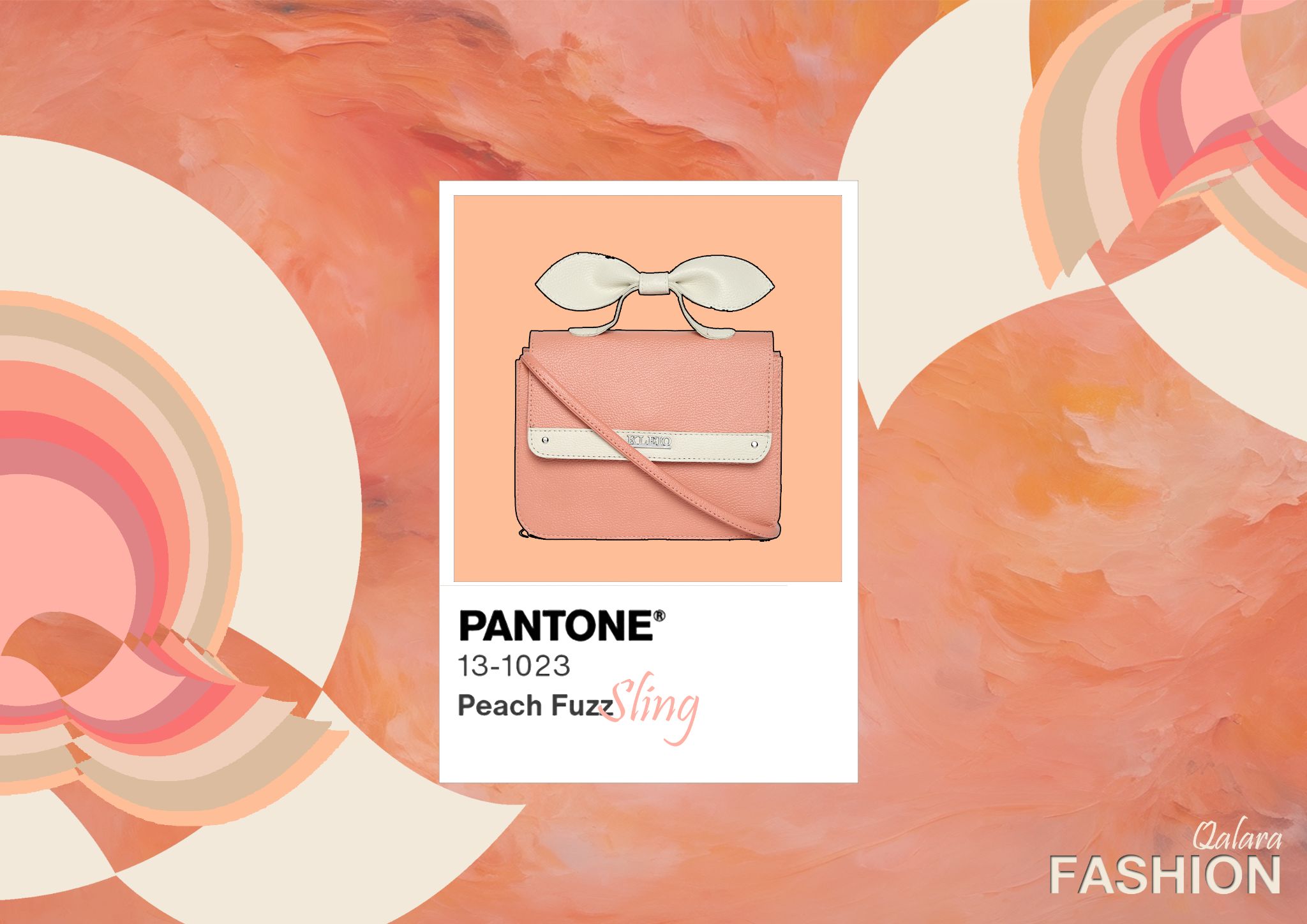
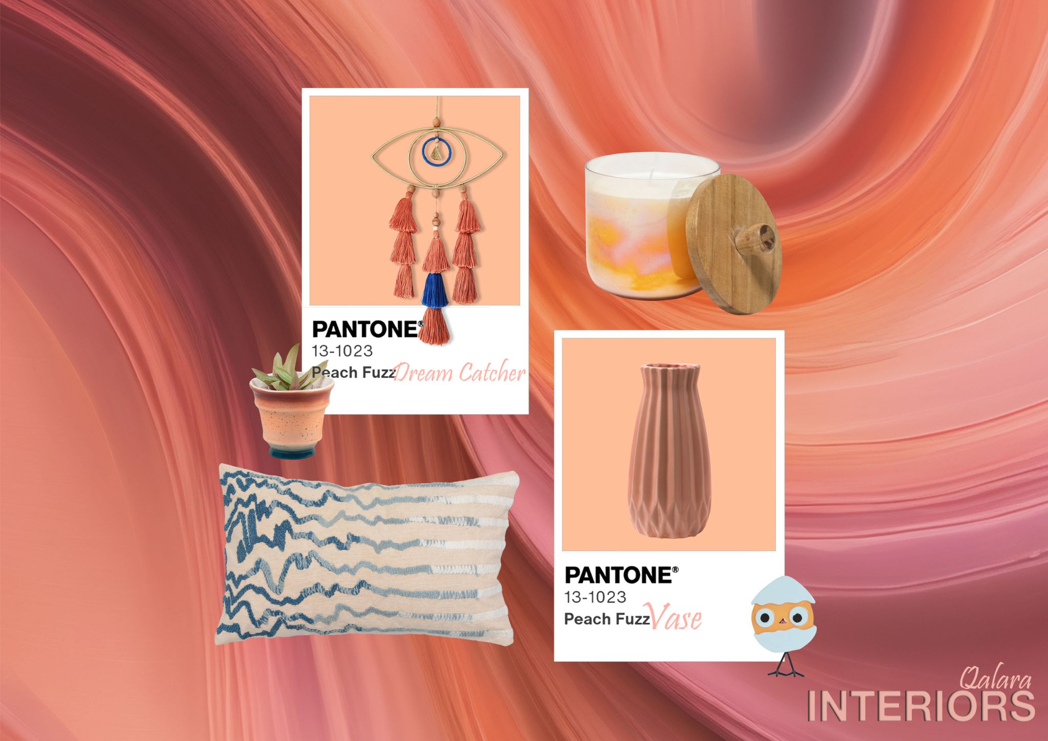
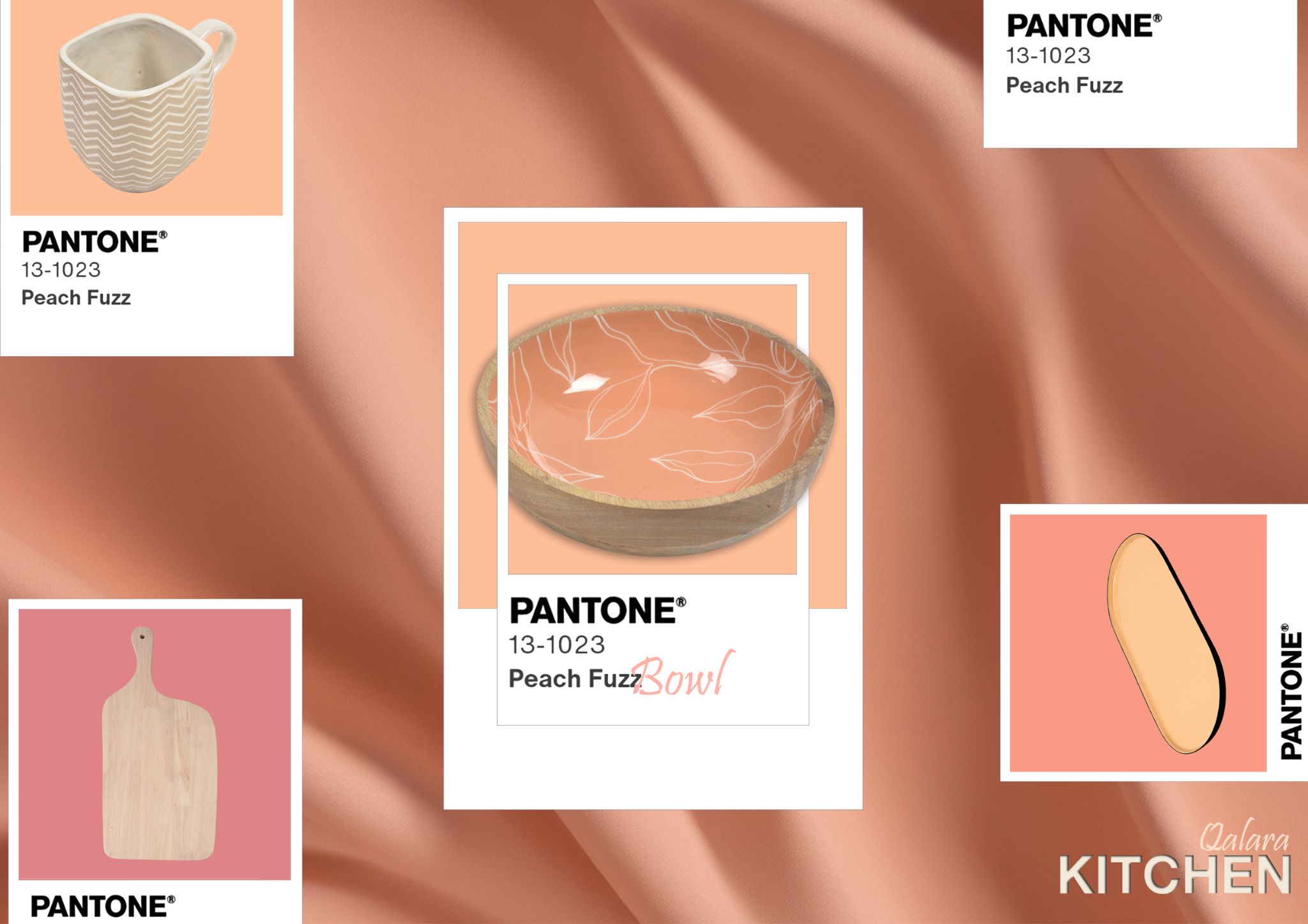
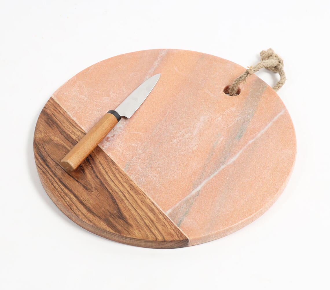
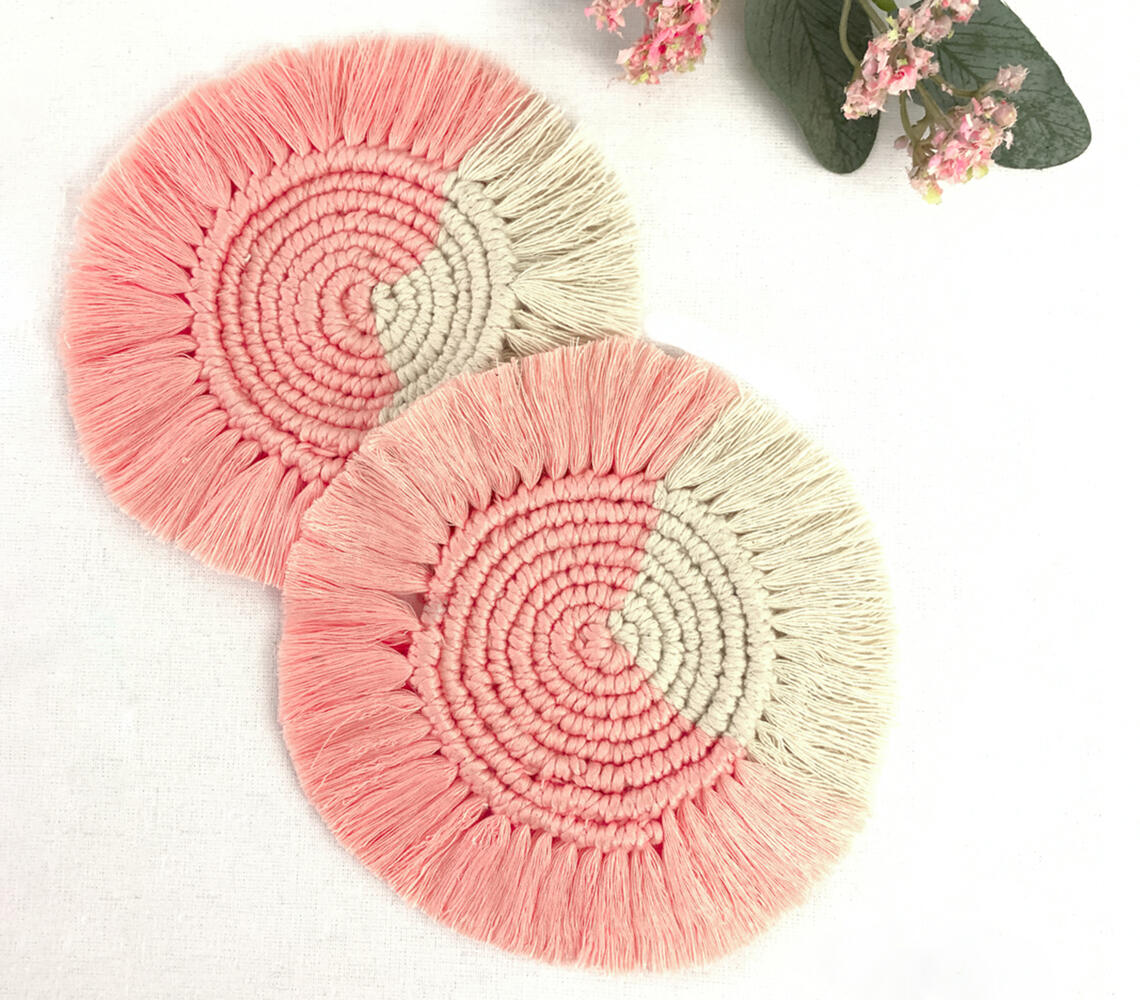
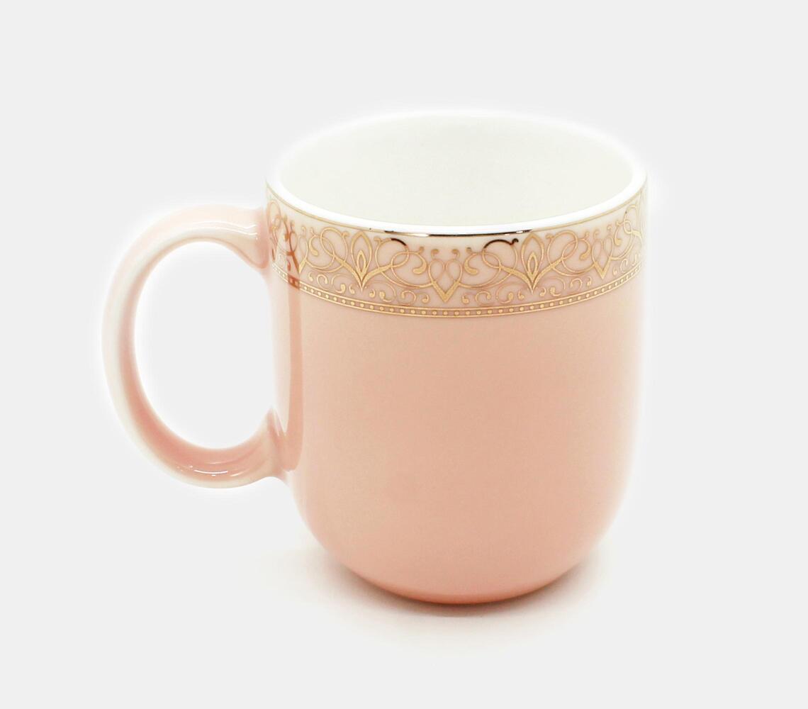
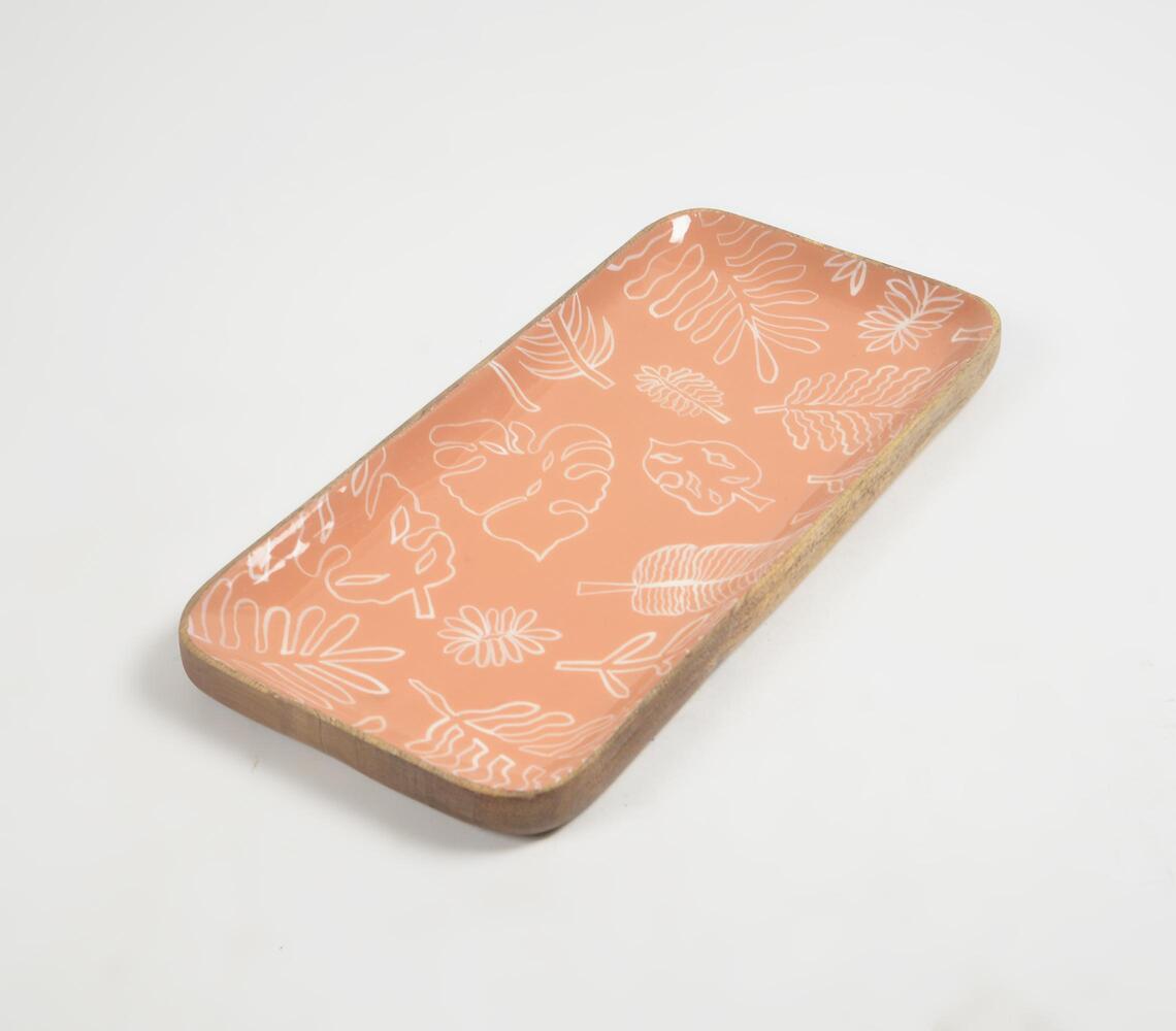
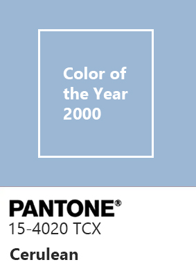
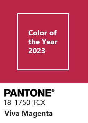
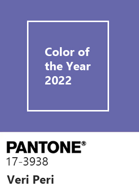
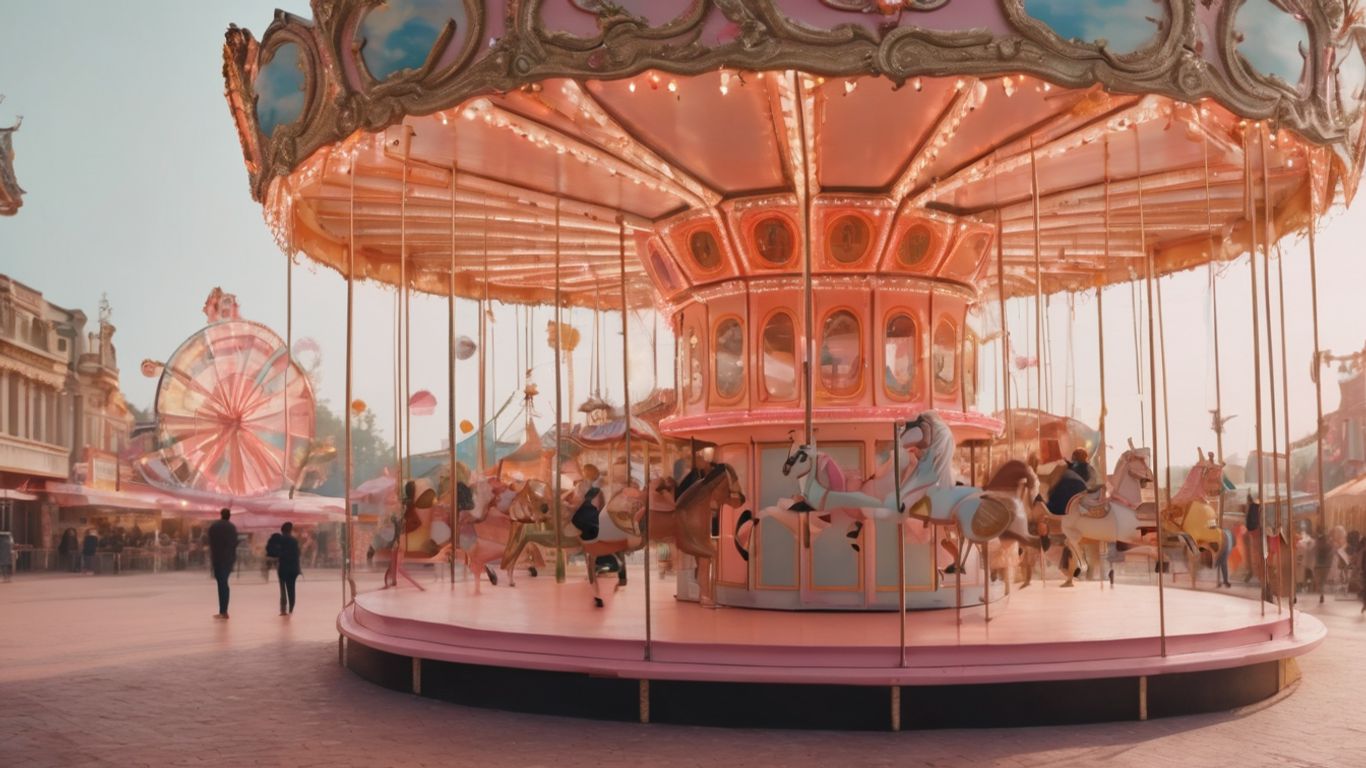
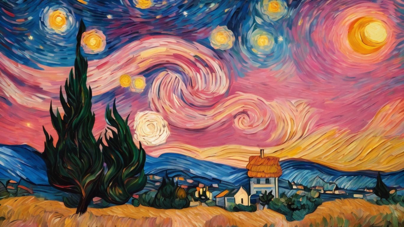
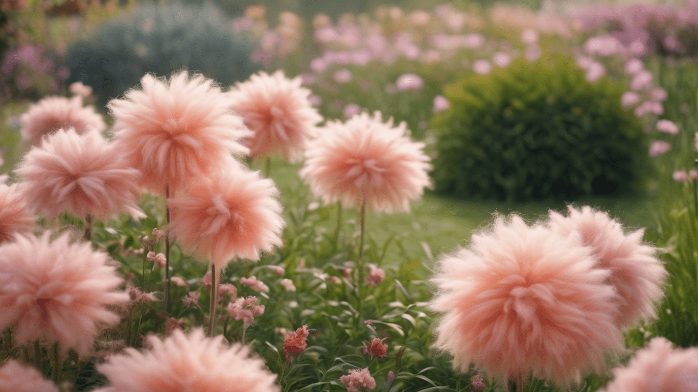
Decoding Pantone Color of the Year 2024


Hey Tanya, thank you so much!
The aesthetics and content blend seamlessly, creating a delightful experience. Well done!
Hey there, thank you so much!
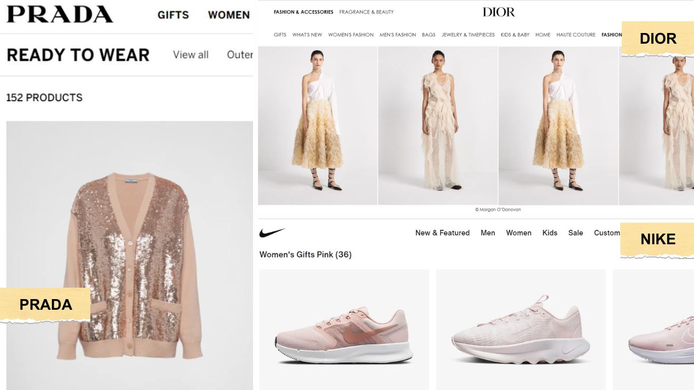
Loved reading about this extensively comprehensive breakdown of the winning Color of the Year. This article does an excellent job of explaining how this fascinating color can be used in various applications. I found it full of insights and interesting to read.
Thank you so much Tanaya. Appreciate your comment and so happy you found the blogpost ‘peachy.’
For those who admire creativity, this piece is a goldmine because of its stunning aesthetics and graphical portrayal.
Hey Akashdeep, thank you so much for your kind words. We’re always striving to put the best content out there!


Tanya Chaturvedi
LOVE THIS PIECE! 💜 💜 so well articulated and it’s lovely to see just well-researched articles